This post may contain affiliate links. Please see my disclosure policy for details.
Fall Fireplace Mantel Decor: Transform Your Living Space This Autumn
Contents
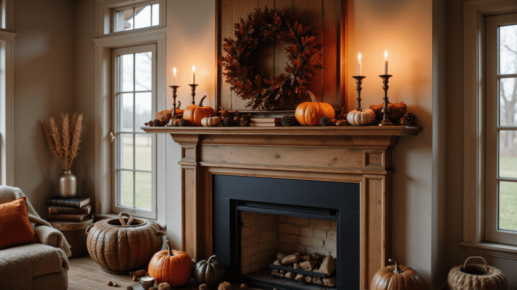
Fall fireplace mantel decor is giving me that cozy, pumpkin-spice-everything feeling before the season even arrives.
I get it—you’re staring at your mantel right now, wondering how to make it look like those gorgeous autumn spreads you see on Pinterest without spending a fortune or making it look like a craft store exploded in your living room.
Let me walk you through exactly how I decorate my fall mantel, and trust me, it’s easier than you think.
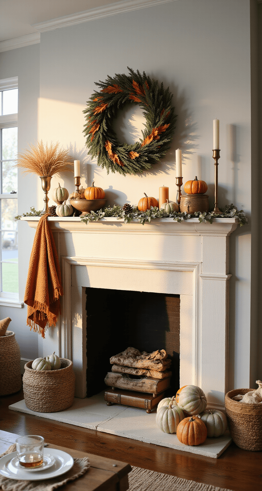
Why Your Mantel Matters More Than You Realize
Your fireplace mantel is the first thing people notice when they walk into your living room. It’s the focal point, the conversation starter, the Instagram-worthy spot. During fall, it’s your chance to bring that crisp, golden-leaves feeling indoors without tracking actual leaves all over your carpet.
Start With a Killer Focal Point
Here’s what I learned the hard way: you need one standout piece.
Choose ONE of these as your anchor:
- A large fall wreath made from real or faux materials
- An oversized mirror with autumn garland draped around it
- A piece of seasonal artwork or wall hanging
- A massive vintage sign with fall messaging
Everything else you add should support this main piece, not compete with it.
I made the rookie mistake of putting up three different focal points my first year. It looked chaotic. Pick one hero piece and build around it.
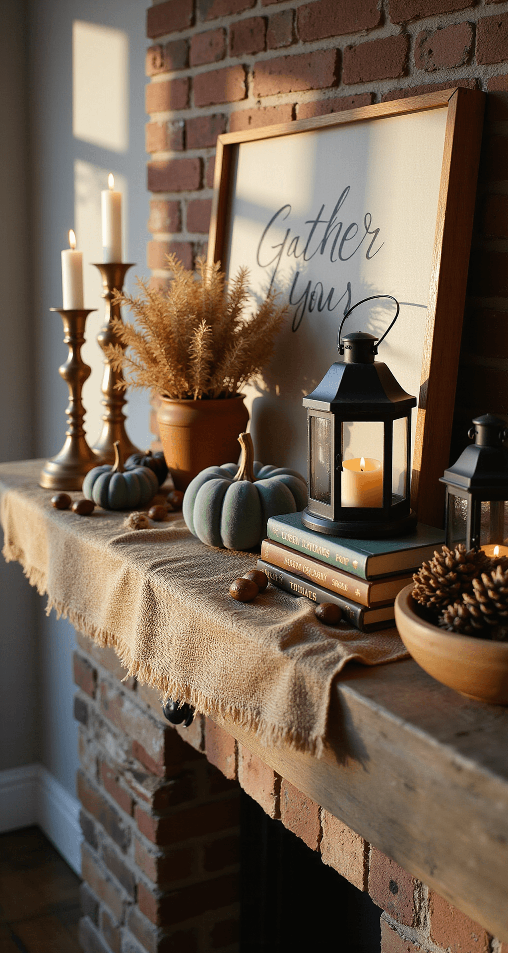
The Essential Elements That Actually Work
Let me break down what I use every single fall, without fail.
Natural elements (the affordable route):
- Pinecones from your backyard (free!)
- Acorns and chestnuts
- Branches with fall leaves
- Wheat stalks or dried grasses
- Mini gourds and pumpkins from the farmers market
Textured pieces that add depth:
- Woven baskets stacked or displayed
- Burlap runners or fabric strips
- Chunky knit blankets casually draped
- Wooden bowls or trays
- Vintage books stacked horizontally
The lighting game-changers:
- Brass candlesticks with cream or rust-colored candles
- Battery-operated lanterns with flickering “flames”
- String lights tucked behind garland
- Mercury glass votives
Trust me on the lighting—it transforms everything from “meh” to “magazine-worthy” once the sun goes down.
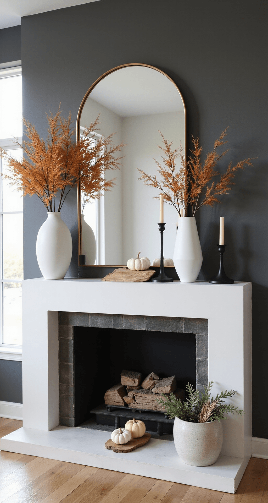
Color Schemes That Never Fail
You don’t need to use every fall color at once. In fact, please don’t.
Early Fall (September to early October):
- Muted greens and sage
- Cream and ivory
- Soft golds
- Touches of rust
Peak Fall (Mid-October to November):
- Deep oranges and burnt sienna
- Rich burgundy and wine
- Chocolate browns
- Golden yellows
I transition my mantel twice during fall season because I genuinely can’t help myself. But you absolutely don’t have to—pick one palette and stick with it.
The secret is choosing colors that already exist in your room and amplifying them. If you have gray walls and navy accents, don’t suddenly go full orange explosion. Add warm cognac tones, creams, and natural wood instead.
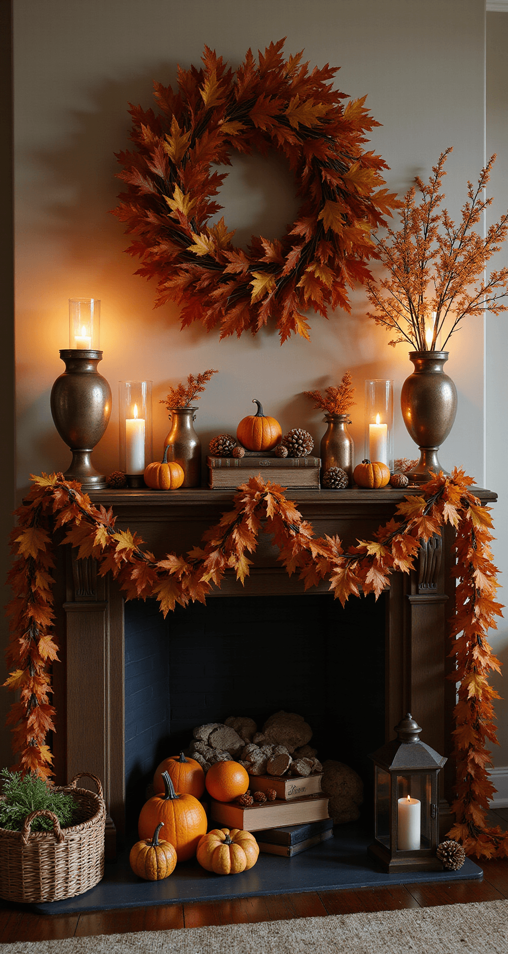
How I Actually Arrange Everything (The Formula)
This is the part where most people freeze up.
Here’s my step-by-step process:
Step 1: Lay the foundation
Place your focal point first—centered or slightly off-center if you’re feeling adventurous. Add a fall garland along the base of your mantel. This creates a visual anchor for everything else.
Step 2: Add height variation
Use the rule of three heights: tall, medium, low.
- Tall: candlesticks, vases with branches, lanterns
- Medium: pumpkins, stacked books, decorative boxes
- Low: scattered leaves, small gourds, tea lights
Nothing should be the same height. This creates visual interest and keeps your eye moving across the display.
Step 3: Create groupings
Don’t spread items evenly across your mantel like soldiers in formation. Group items in clusters of three or five (odd numbers look better). Leave intentional negative space.
Step 4: Layer like crazy
This is where magic happens.
- Lean artwork against the wall with smaller items in front
- Drape fabric under a wooden bowl
- Tuck greenery behind picture frames
- Stack books with a pumpkin perched on top
Step 5: Step back and edit
Remove at least one item. Probably two. Less is more, even in fall decorating.
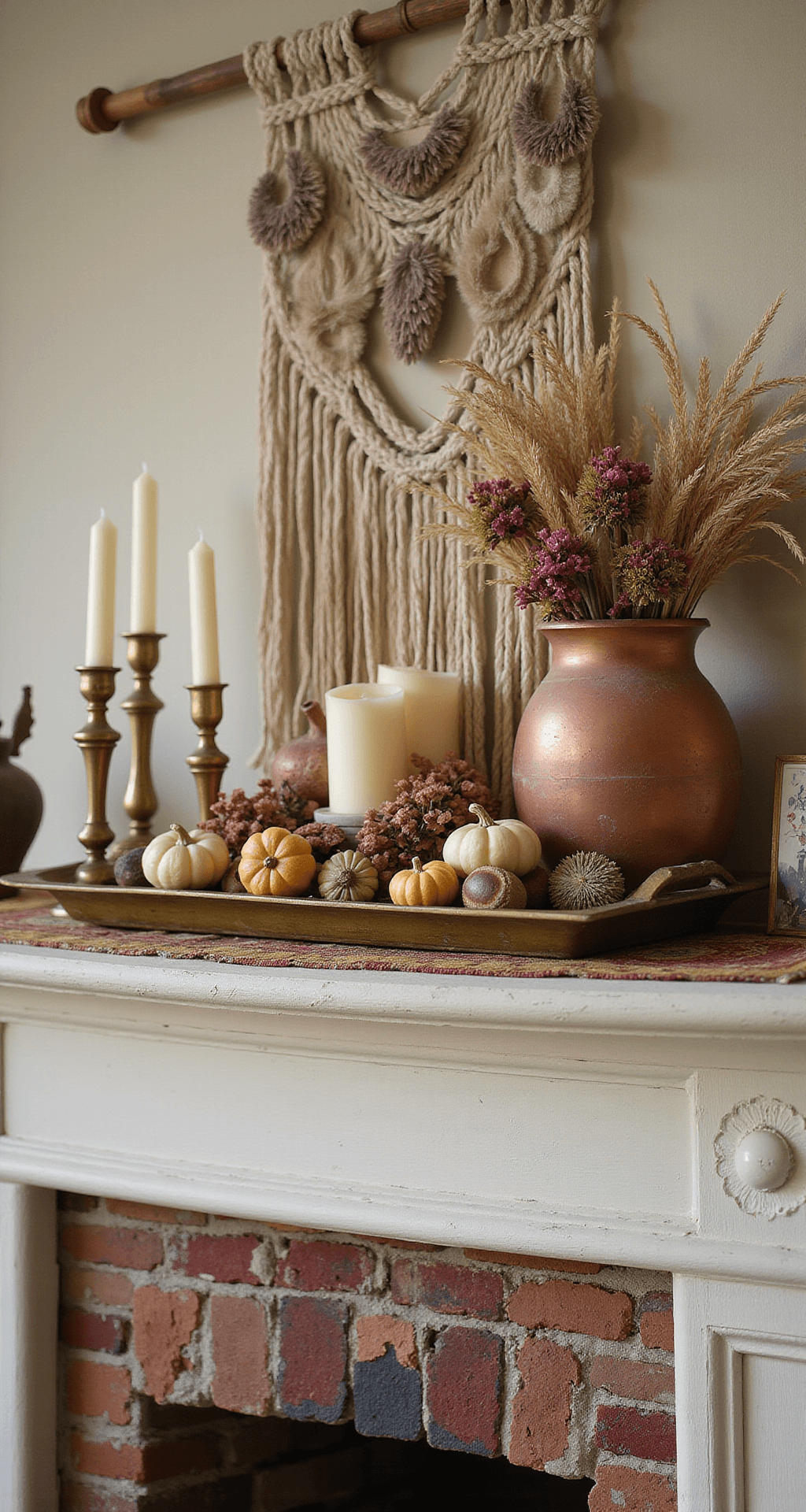
Real vs. Faux: My Honest Take
I use both, and I’m not apologizing for